MEET OUR CLIENT

Barbara Jue, Co-Founder/Board Member
Began Lavender Seniors in response to the significant gaps in health and human services that were experienced by aging LGBTQ+ folks.
Tasked to redesign website to highlight two key topics:
Feature events within their programs & services offered to bring the LGBTQ+ community together
Emphasize their mission and purpose using more colors and shapes
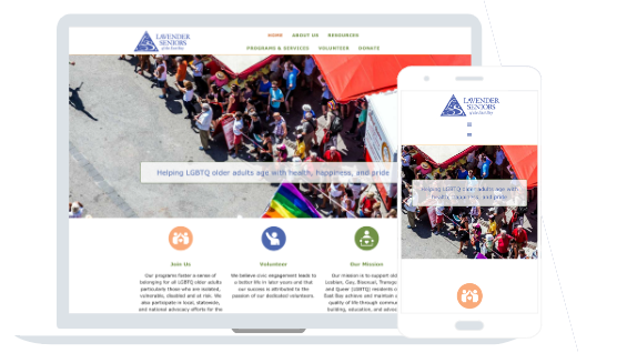
CURRENT WEBSITE
Link is available
here

RESEARCH PLAN
Key Focus Areas
What expectations do users have for a non-profit website?
Are there key functions our users (LGBT Seniors, Advocate, Volunteers, Donors) look for in a non-profit website?
What is the user's perspective on how the website could be changed or improved?
Methodology
For our user research study, we identified our target user types, created a proto-persona, completed a competitor analysis, defined our research objectives, developed an interview script, and conducted five user interviews.
USER INSIGHTS
“It would be nice to see "upcoming events" featured on the homepage”
"With non-profits it’s important to understand why they got started, before volunteering"
"The website has the basic functions, but could be clearer and more visually appealing"
COMPETITOR ANALYSIS

Strengths
Clear navigation
Large library of resources
National organization
Weaknesses
Mission is broad due to national status
Outdated imagery
Color scheme could be overwhelming to some

Strengths
Pleasing color scheme
Organized logically
Strong set of resources
Accessible design
Weaknesses
Busy home page
Complicated footer
No visual logo
Can be challenging to navigate due to the amount of information

Strengths
Strong visual design
Page is organized well
Donation form is easy to find
Weaknesses
Site has a lot of info, which makes it more complicated
Not very modern in design
Some images are very low-resolution
AFFINITY DIAGRAM
Link to
Miro Prototype
“Non -Profit sites should answer "What are they actually doing?"
* had trouble clicking through the navigation
Homepage: Join us and Volunteer icon stood out the most ("simple and nice")
“needs an "ok here is how I can help out"
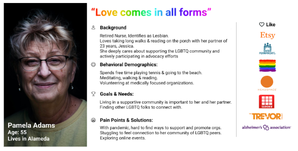
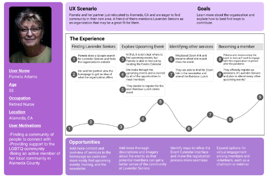
USER PERSONA

PROBLEM STATEMENT
Lavender Seniors is a non-profit that serves eldery LGBTQ people in the East Bay by providing important programs & services.
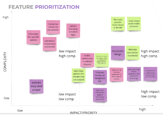
Their current web presence does not bring their community and key services to the forefront for users and can be improved to better emphasize the events, donation opportunities, and services provided by their organization.
How might we better refine the website design to appear more engaging, modern, and embody the feeling that Lavender Seniors brings to LGBTQ+ elders through their services?
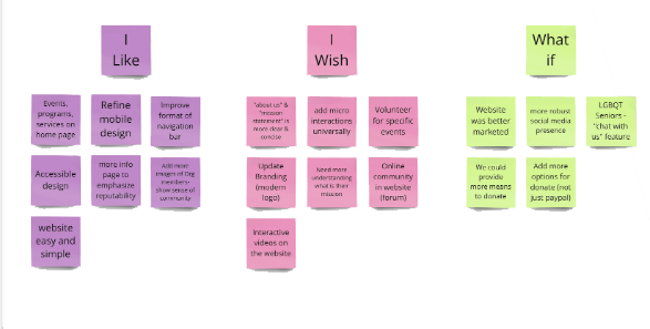
I LIKE, I WISH, WHAT IF


USER
JOURNEY
MAP
Link available
here

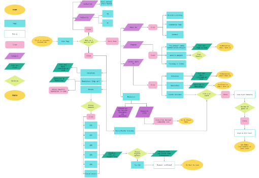
USER FLOW
(FULL)
Link available
here

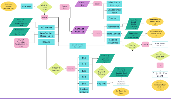
USER FLOW (FOCUSED)
Link available
here

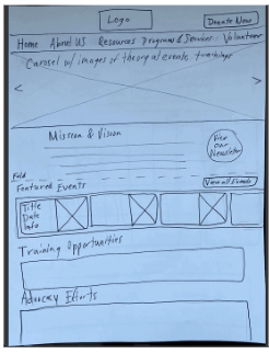
WIREFRAME SKETCHES
Link To:
All Sketches on Google Drive

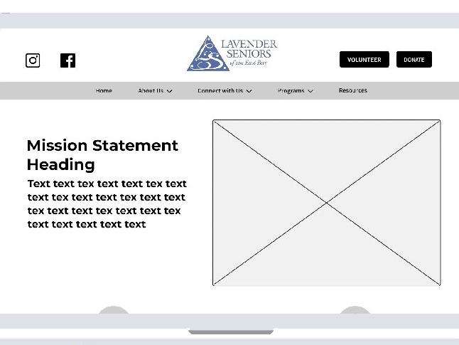
LO-FI WIREFRAMES
Link to Figma Prototype

USER TESTS (LO-FI)
“Clear understanding of reaching events, volunteer & donate page”
“On Leadership Team page, ‘full bio’ needs an exit point in order to explore other company members”
“Its Cool, would be nice if the volunteer & donate buttons had a pop of color”
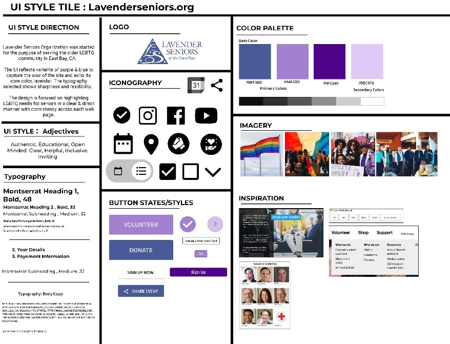
STYLE
GUIDE
Link available
here

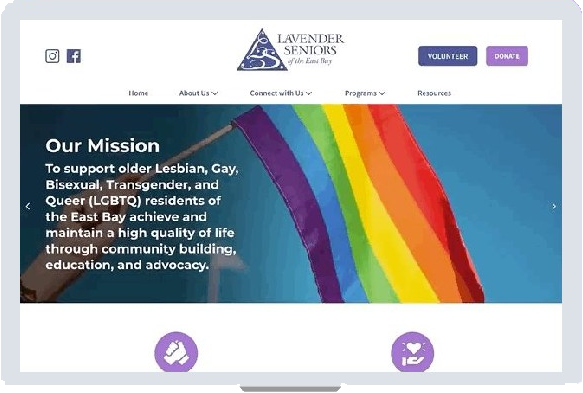
HI-FI WIREFRAMES
(DESKTOP)
Link to
Figma Prototype

USER TESTS (HI-FI)
“On donate page, flush out the payment or login of paypal” - specific features or actions needed more guidance on how to fill out required info
“Better to keep the newsletter months as drop down instead of spelling out each month on the page”
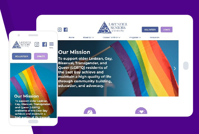
HI-FI WIREFRAMES (MOBILE & iPAD)
Link to
Figma Prototype

NEXT STEPS
Closing Thoughts:
Having a client invested in the project resulted in a different set of focus points than previous projects
Many conversations around color scheme
Considering elderly people as a primary user group impacted our design approach
Iterations Moving Forward:
Develop wireframes for additional flows, mobile & iPad devices
See if updated logo would be considered by client
Evolve donate pages further
Focus on designing ‘Resources’ page to capture the training materials offered by the organization
View Next Project
